Wednesday, 28 April 2010

Hadrian Pigott


Hadrian Pigott takes everyday objects and makes them striking by creating cases that will only fit them. They're all essentially useless but they have an air of luxury thanks to the materials that have been used. The solid, smooth, pristine exteriors of the cases gives them a sense of grace and makes them look as if they should be encasing expensive instruments. I like how he has mixed materials to make them more sensual, the exteriors make you want to feel their cool smoothness whilst the interiors are lined with velvet to make them seem more protective and warm to the touch, together the materials make the item extremely inviting and hard to resist.
I like the idea of something being encased and no clues being given as to what the case holds but when unveiled the interior is a surprise. Also interested in giving an illusion of something being held inside a case by vacuum forming a shape into the surface, the case would look like an average leather suitcase apart from the contoured surfaces then when opened it would house nothing more than the average suitcases items.

Thursday, 15 April 2010

Textile Print


In the print workshop we were shown a variety of different methods and effects that could be achieved using a silk screen. The effects we could achieve by applying different chemicals and paints to the surface of a material were really interesting and varied. Before we started trying out techniques such as devoré and flocking, we were given an introduction into paint silk screening using pre-prepared screens to get used to the method and to test out colours and layering. Most of the pigments we used were water based as this prevents the screen from becoming blocked, the pigment doesn't actually dye the material but sit on the surface and need to be heat fixed to stop them from washing off.
We were also shown heat transfer when dye is painted onto paper and when heated becomes fixed to a fabric surface, however the colours were difficult to judge as they became a lot more vivid after heat was applied and the effects were quite rough and unsophisticated.
Devoré is a technique which destroys part of a mixed fibre fabric to leave a slightly see-through material. The paste formula is screen printed onto the fabric, left to dry and then heated till it is slightly burnt and brown coloured, this is then washed off to leave the finished piece. The paste burns away all the natural fibres in the fabric so if the material was 100% natural then it would either fall apart, depending on how close and detailed the pattern, or would leave holes in the material. I liked this method though I doubt I could apply it to anything in this project, but it could prove useful in another.
I particularly liked the effect of the flock printing which gives a velour texture. A water based adhesive resin is painted onto the surface, once dry the area is covered with paper backed viscose velvet and fixed through heat. I liked the raised textured finish the flock gave to the cardboard sample in the top image. I also tried applying it to acetate and although it went slightly translucent it did stick to the surface though if it was rubbed it would come off.
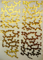
We were also shown foil printing. The whole process is very similar to flocking but instead of using a sheet of flock, a piece of foil is adhered using heat. I liked the effect I got from the foiling when using my own screen, I think the leaves look really successful in gold and I also like the negative that I was left with.
The final technique we were shown was puff binder, this is screen printed onto a surface and when heat is applied to it the puff binder expands for a 3D effect. I found that with all the techniques I preferred them when applied to a non fabric surface, although they're designed to be used with fabric so that they adhere to the surface, I found the finished effect far more interesting. I really want to test out some more designs and make some more of my own screens, it might not be applicable to this project but the I found the whole workshop really useful.

Wednesday, 14 April 2010

Workshop: Casting


The casting workshop was definitely one of the most interesting and useful workshops. In this workshop we learnt how the object should be cast so that the original could still be removed from the cast, how to mix the plaster and then how to cast the finished mould. I took in a small ceramic duck to cast, it's shape was quite simple so I only needed to make two halves for the mould. I found that at the end of the process I preferred the mould to the wax duck I got from it, I liked how the mould was a flawless copy of the duck and also the smoothness of it, whereas the wax ducks were rougher and needed trimming to shape due to lost wax. 
I'd like to use this method to create some more objects, perhaps making the cast into the finished product and making it from different materials to see what different effects I could achieve. If the cast were to be the finished item I would want to line it with a contrasting material, such as velvet or silk, to cushion the object the mould had been made from. I'd also like to try out ways of making an object out of a delicate material, such as porcelain though this may prove difficult to remove from the mould.
I'd like to see if I could make a mould that could potentially be a useful object, some kind of storage or protective carrying device. I think the technique is interesting and there are a lot of different avenues I could explore using it.

Monday, 12 April 2010

Spooner + Watts

http://spoonerandwatts.co.uk/site/

Each of the Spooner + Watts products are finished to such a high quality that when I first saw them I couldn't believe that they're all made from the highest quality leather and suede to give the impression of paper and card products. The table top on the café table above is upholstered in hand finished white and blue bridle leather squares for the gingham effect. The bags in the picture are made from leather, the straps are plaited leather to look like material. The attention to detail is key to the success in all the products, one of my favourite accessories of theirs is the small, brown paper bag to the right. It's finished so flawlessly with every line, fold and join in exactly the right place that the end effect completely fools the eye into thinking it must be paper when it's actually made from natural goatskin.
Most of the Spooner + Watts products are reinventions of different forms of packaging or storage, instead of using their materials to produce something to just be placed on a shelf, they have created pieces which form discussions and that are completely functional so as to be used daily.
This kind of visual deceit is different from the desired effect of the SOFttILES, it is more about an everyday object becoming something of luxury and high quality materials. The surprise at the product being from the wrong materials is also more powerful and provides a real interest in the product, making the viewer want to become to owner of such a unique piece.

SOFttILES


I've been looking into different types of visual deceit and the way that materials can be mixed and finished so they have the appearance of something else. Elena Goray's SOFttILES are porcelain tiles inspired by the pattern on the Chesterfield chair and are finished with such precision that they look more like soft, straining leather. The effect is so uncanny that they draw the viewer in to touch it to confirm what it is.
The juxtaposition of the material vs. what the eye perceives can form the basis for producing a piece which tests the brain and causes the viewer to feel a need to somehow confirm the piece through touch or another sense other than sight. I like the idea that the viewer could become so bewildered by the piece that they would need to touch it just to see whether it was hard or soft, warm or cool and couldn't feel satisfied with what knowledge their eyes could gain from it.
I want to produce something visually stimulating that could also provide a focal point, just as Philippe Stark did with his lemon squeezer 'Juicy Salif'. Though Stark designed a completely impractical product the point behind it wasn't for its use, rather the conversation it would provide and the way it could become a sculptural piece for the kitchen. Though I doubt I could produce anything that could match Stark, I would still like the piece to take inspiration and some of the qualities of his juicer.