Tuesday, 18 May 2010

Beyond Boxes


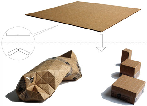
Julia's suggestion of making a customisable form lead me to look at Beyond Boxes. The prototype created by Patrick Sung takes the concept of the traditional corrugated cardboard box and created a cheaper alternative where the box is flat-packed and pre-creased with perpendicular and diagonal lines which means that it can be folded in any direction, into any size and any kind of shape. He takes the cardboard box to the next level, building on its properties and challenging our perceptions of the square box. The folds allow for the contents to be tightly wrapped, minimising on excess packaging for the contents but it still allows for being turned into the classic box.
I considered combining the concept behind the boxes with my origami shapes, though it would have to be extremely simple and obvious in how it would be folded or it could become very confusing. Beyond Boxes works well as it is such a simple idea which is clear and simple to use whereas origami has always been a more complicated art form where there's a very specific way to fold certain shapes. I could move away from the idea of origami to try to create a more customisable form though I particularly like the controlled way origami is folded, so would want to preserve this as much as possible.

Julia Lohmann


Julia Lohmann gave us a lecture about her work and her current projects she's working on and afterwards spoke to us all individually about our work, giving us feedback on where she thought we could expand and develop. She was particularly helpful in giving me ideas on how I could take the origami to the next level in ways which I hadn't considered and gave me a lot of ideas on furthering my work.
During her lecture she showed us images of her work and videos she had made. A lot of her work is concerned with the preservation of natural forms and with challenging peoples boundaries and perceptions between art and revulsion. She has done quite a lot of work around how people treat beef and leather as separate, unrelated by-products to a cow and has made a series of cow benches using a single whole hide of leather to cover a cow shaped form. Another project she did focused on the voids left when a cow is slaughtered and all its organs are removed. She cast molds of it by pouring plaster into it and finally creating a resin and fibreglass form of this void which would otherwise be quickly be lost after the end of the cows life. She has also done projects around preserving sheep stomachs, maggots, sweet teeth, aliens and Japanese fish crates, one I was particularly interested in is a series she is currently working on around kelp and how it can be manipulated. The picture above is of one of her experimental lamps made from kelp where it is wrapped around wooden legs, I like the use of light in the piece and how more of the kelp constructs can be added to dim the light. She is exploring the potential of kelp as a design material and has also turned it into a laminating material, the colours from the kelp range from deep browns to light greens and would provide a cheaper alternative to wood laminates.
When I spoke to Julia about my project she suggested looking into ways I could make it my own, possibly through creating my own origami patterns or by allowing the user to be able to customise the form, either through using drawstrings or different cutting and folding patterns. She also suggested looking at different materials which could add value to the piece but also to think more about what I could package. I'd like the origami to be customisable but from further research I feel that a folding pattern would be too complicated and that the origami would be more valuable if already formed and that materials could play a large part in it.

Copper Origami


The first material testing I did with the origami was to try out a few of the forms in copper sheet. This material is relatively easy to fold though this depended on how many times I tried to fold it, the more times I folded it there became a greater possibility that holes would be made and that I wouldn't get such a crisp line. 
The box in the foreground of the photo above is the first test I did with the copper, this required only one square and meant that there were a lot of initial folds before it was assembled. From this sample I found that I liked the aesthetic of the copper and how it could make the form more interesting, but it wasn't very successful and the metal crumpled too much.
The second box I made, in the background of the photo above, was made up of three squares of copper, each piece was only folded four times in total which meant that it was easier to get an accurate crisp line. The three sides then slot into one another and, as the assembly is so straight forward, they fit together quite accurately.
I particularly like the copper as a material as it makes the origami more durable and appear more valuable. I'd like to see if I could find a way to make the boxes fit together better and also to remove the sharp edges made when cutting the squares. They could also be made to appear more sumptuous by lining them with a plush material such as velvet so that the items inside were being cushioned and protected.

Paper Origami


I started my research into origami by looking at existing patterns for boxes and cubes as these are the classic kinds of containers and I also initially wanted the boxes to be able to fit within each other, like Russian dolls.  Above are a few of the more successful designs I made, they all differ in the amount of squares of paper they were folded from and how they would fit together. These are also the strongest and most rigid box designs I tested so if I made them in a softer material they would be harder to break or squash. 
I am also interested in the way that the boxes are opened, having two halves is the most common way for a box to be opened but I wanted to look at the way it could be made more interesting and interactive for the user. I made a couple of cubes but my favourite was fixed together by slotting the sides into each other, this makes it the least collapsible as each side is supporting another and are folded so many times that they are relatively thick. I'd like to look into a way to make the cube into a usable box so I will need to look into ways to seal the sides and make them stronger.
The aesthetic of the folded cube could be affected if dipped into a hardener like resin as you would no longer be able to feel the texture of the folds, which I feel is a fundamental part to the origami shapes as they always appear as if they could still be unfolded into a flat piece of paper. Porcelain could enhance the feel of the origami though it would then become extremely brittle and too many coats could again spoil the surfaces.
I feel that the best route to continue on with the origami would be to look at different materials, possibly metals or different types of paper, to try to retain and enhance the aesthetic of the origami.

Thursday, 6 May 2010

Origami


Origami, the art of paper folding, can be used to create hundreds of different images and shapes and could provide a decorative and interesting solution as a form of packaging. Different materials used can give a unique aesthetic to the form and could make my packaging more visually interesting. I want to look into the various ways that origami can be used to make boxes and a forms that could hold something. The experience could be heightened by making it more like opening a present by using multiple layers, like in Russian dolls or pass-the-parcel.
I also want to look into ways that the paper could be given more strength or even fragility by applying different finishes to it and also what different aesthetics could be achieved through this.

Apple Packaging


After a group crit and from talking through my ideas, I found that they key aspect of my design is based around the idea of packaging and how something could be designed to encase it to prevent movement and give it more protection.
I decided to research more into the notion of packaging and looked at the way that Apple package their products. Over the years they have cut down over 50% of packaging that they used to use for their original iPods and MacBooks, even though the products now may not be any different in size. This means that they're shipping products in a more environmentally friendly way as they can ship more at a time and less materials are being used in the boxes holding them, not to mention that the products themselves are now being produced with fewer toxins, longer lasting batteries and more energy-efficient hardware. Apple aim to put an experience into every part of their product, right down to the packaging and it is designed so flawlessly and neatly that the owner of their new Apple product will quite often keep the box that it came in.
I like the idea of producing a packaging which could become multi-purpose and provide an experience when opening it. When buying an expensive dress or perfume, the item will be wrapped, placed in a quality bag with more decorative pieces added to it. I like the idea of something being made to appear more expensive than it is by the quality of the materials used to package it. I'd also like to produce something which wouldn't be discarded when opened, but rather would be used for another purpose and to create something decorative or which could house something else.

Wednesday, 28 April 2010

Hadrian Pigott


Hadrian Pigott takes everyday objects and makes them striking by creating cases that will only fit them. They're all essentially useless but they have an air of luxury thanks to the materials that have been used. The solid, smooth, pristine exteriors of the cases gives them a sense of grace and makes them look as if they should be encasing expensive instruments. I like how he has mixed materials to make them more sensual, the exteriors make you want to feel their cool smoothness whilst the interiors are lined with velvet to make them seem more protective and warm to the touch, together the materials make the item extremely inviting and hard to resist.
I like the idea of something being encased and no clues being given as to what the case holds but when unveiled the interior is a surprise. Also interested in giving an illusion of something being held inside a case by vacuum forming a shape into the surface, the case would look like an average leather suitcase apart from the contoured surfaces then when opened it would house nothing more than the average suitcases items.

Thursday, 15 April 2010

Textile Print


In the print workshop we were shown a variety of different methods and effects that could be achieved using a silk screen. The effects we could achieve by applying different chemicals and paints to the surface of a material were really interesting and varied. Before we started trying out techniques such as devorĂ© and flocking, we were given an introduction into paint silk screening using pre-prepared screens to get used to the method and to test out colours and layering. Most of the pigments we used were water based as this prevents the screen from becoming blocked, the pigment doesn't actually dye the material but sit on the surface and need to be heat fixed to stop them from washing off.
We were also shown heat transfer when dye is painted onto paper and when heated becomes fixed to a fabric surface, however the colours were difficult to judge as they became a lot more vivid after heat was applied and the effects were quite rough and unsophisticated.
Devoré is a technique which destroys part of a mixed fibre fabric to leave a slightly see-through material. The paste formula is screen printed onto the fabric, left to dry and then heated till it is slightly burnt and brown coloured, this is then washed off to leave the finished piece. The paste burns away all the natural fibres in the fabric so if the material was 100% natural then it would either fall apart, depending on how close and detailed the pattern, or would leave holes in the material. I liked this method though I doubt I could apply it to anything in this project, but it could prove useful in another.
I particularly liked the effect of the flock printing which gives a velour texture. A water based adhesive resin is painted onto the surface, once dry the area is covered with paper backed viscose velvet and fixed through heat. I liked the raised textured finish the flock gave to the cardboard sample in the top image. I also tried applying it to acetate and although it went slightly translucent it did stick to the surface though if it was rubbed it would come off.
We were also shown foil printing. The whole process is very similar to flocking but instead of using a sheet of flock, a piece of foil is adhered using heat. I liked the effect I got from the foiling when using my own screen, I think the leaves look really successful in gold and I also like the negative that I was left with.
The final technique we were shown was puff binder, this is screen printed onto a surface and when heat is applied to it the puff binder expands for a 3D effect. I found that with all the techniques I preferred them when applied to a non fabric surface, although they're designed to be used with fabric so that they adhere to the surface, I found the finished effect far more interesting. I really want to test out some more designs and make some more of my own screens, it might not be applicable to this project but the I found the whole workshop really useful.
Wednesday, 14 April 2010

Workshop: Casting


The casting workshop was definitely one of the most interesting and useful workshops. In this workshop we learnt how the object should be cast so that the original could still be removed from the cast, how to mix the plaster and then how to cast the finished mould. I took in a small ceramic duck to cast, it's shape was quite simple so I only needed to make two halves for the mould. I found that at the end of the process I preferred the mould to the wax duck I got from it, I liked how the mould was a flawless copy of the duck and also the smoothness of it, whereas the wax ducks were rougher and needed trimming to shape due to lost wax. 
I'd like to use this method to create some more objects, perhaps making the cast into the finished product and making it from different materials to see what different effects I could achieve. If the cast were to be the finished item I would want to line it with a contrasting material, such as velvet or silk, to cushion the object the mould had been made from. I'd also like to try out ways of making an object out of a delicate material, such as porcelain though this may prove difficult to remove from the mould.
I'd like to see if I could make a mould that could potentially be a useful object, some kind of storage or protective carrying device. I think the technique is interesting and there are a lot of different avenues I could explore using it.

Monday, 12 April 2010

Spooner + Watts

http://spoonerandwatts.co.uk/site/

Each of the Spooner + Watts products are finished to such a high quality that when I first saw them I couldn't believe that they're all made from the highest quality leather and suede to give the impression of paper and card products. The table top on the café table above is upholstered in hand finished white and blue bridle leather squares for the gingham effect. The bags in the picture are made from leather, the straps are plaited leather to look like material. The attention to detail is key to the success in all the products, one of my favourite accessories of theirs is the small, brown paper bag to the right. It's finished so flawlessly with every line, fold and join in exactly the right place that the end effect completely fools the eye into thinking it must be paper when it's actually made from natural goatskin.
Most of the Spooner + Watts products are reinventions of different forms of packaging or storage, instead of using their materials to produce something to just be placed on a shelf, they have created pieces which form discussions and that are completely functional so as to be used daily.
This kind of visual deceit is different from the desired effect of the SOFttILES, it is more about an everyday object becoming something of luxury and high quality materials. The surprise at the product being from the wrong materials is also more powerful and provides a real interest in the product, making the viewer want to become to owner of such a unique piece.

SOFttILES


I've been looking into different types of visual deceit and the way that materials can be mixed and finished so they have the appearance of something else. Elena Goray's SOFttILES are porcelain tiles inspired by the pattern on the Chesterfield chair and are finished with such precision that they look more like soft, straining leather. The effect is so uncanny that they draw the viewer in to touch it to confirm what it is.
The juxtaposition of the material vs. what the eye perceives can form the basis for producing a piece which tests the brain and causes the viewer to feel a need to somehow confirm the piece through touch or another sense other than sight. I like the idea that the viewer could become so bewildered by the piece that they would need to touch it just to see whether it was hard or soft, warm or cool and couldn't feel satisfied with what knowledge their eyes could gain from it.
I want to produce something visually stimulating that could also provide a focal point, just as Philippe Stark did with his lemon squeezer 'Juicy Salif'. Though Stark designed a completely impractical product the point behind it wasn't for its use, rather the conversation it would provide and the way it could become a sculptural piece for the kitchen. Though I doubt I could produce anything that could match Stark, I would still like the piece to take inspiration and some of the qualities of his juicer.

Saturday, 27 March 2010

Hide & Seek

After looking at different types of camouflage and defensive behaviour, I began looking into ways in which people hide in society and after brainstorming around this notion I decided to conduct a experiment where I got my sister and my friend, Tristan, to play the childhood game Hide & Seek.
Hiding is a natural reaction for children when they're scared but when playing it then becomes a game. When I played hide & seek as a child I remember having an adrenaline rush whilst running off to hide and then the anticipation whilst waiting in some dark corner in a house to be found. I wanted Tristan and my sister to recapture this excitement but while playing it outside. I then documented my journey to finding them. The most interesting pictures I got out of it were of the moments before they realised I'd found them, my sister was up a tree and Tristan had hidden on a window sill.
Tristan had a mixture of reactions, he enjoyed it as it 'wasn't an everyday occurrence and you don't often get to hide without question', he chose his spot 'because it was away from the hustle of the street' which meant he was above everyone so he wasn't in anyones way. He also said it was 'more about observing than being observed' and didn't want other people to see him, which is why he went up.
The pictures I took of my sister and Tristan when I found them are the most descriptive of the game, though whilst I was looking for them I came across a couple of places that would also have made a good spot to hide in, so the majority of the pictures could provide a useful source of information for the project.

Thursday, 25 March 2010

Camouflage


Whilst brainstorming around the subject of 'Armour' I looked into camouflage as a form of protection. Animals, insects, fish and birds all use camouflage as a way of protecting themselves as a means of survival, they use it as a way of becoming indistinguishable from their surroundings. Armour can be either offensive or defensive and, even though it may be viewed as the most rudimentary form of armour, it is still a means of protection.
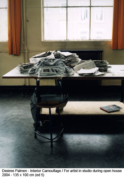
Desiree Palmen, a photographer whos main subject is the camouflage of people, see above. Each suit is designed with the most intricate of detail to allow the person to 'dissolve' into the background. The end effect is to challenge the eye to determine between what is flat and what is spatial. The content of the images is supposed to illustrate the lack of hold the individual has on the world, though is it a world which has a firm hold on the individual. With each image she is inviting the viewer to step closer, to decipher it's hidden commentary and understand the social escape.
I liked the way she could make what would otherwise have been an image of little interest into something engaging by making someone do a double-take of her work and attempt to distinguish the hidden person. I like the visual deceit involved and the idea of hiding within an image or environment. There's a link between Palmen's work and blending into different cultures and social groups so that someone could become essentially invisible, also of hiding in plain view such as an animal would.

Poppy Pitt

Eggs drawing